Microsoft Fabric November 2023 update


Welcome to the November 2023 update.
We have lots of features this month including Narrative visual with Copilot, cross workspace “save as” for Data Factory, the general availability of Semantic model scale-out, and many more. Continue reading for more details on our new features!
Contents
- Core
- Power BI
- Reporting
- Modeling
- Data Connectivity
- Service
- Explore

- Copilot for Power BI in Microsoft Fabric
- OneLake integration for Import-mode semantic models
- RLS/OLS security and stored credentials for Direct Lake semantic models
- Sharable cloud connections for semantic models

- Semantic model scale-out
- Show visuals as tables
- Advanced Filtering for Paginated Reports
- Explore
- Visualizations
- Other
- Synapse
- Data Warehouse
- Query Insights
- Fabric Warehouse publishing Full DML to Delta Lake Logs
- Automatic Data Compaction for Fabric Warehouse
- Fabric Warehouse support for sp_rename
- Improvements to CSV data ingestion
- Fabric enables you to read multi-TB results from Warehouse
- Blazing fast compute resource assignment is ON!
- SSD Metadata Caching
- Fabric SQL support for TRIM and GENERATE_SERIES
- Time-Travelling through data: The Magic of Table clones
- REST API support for Warehouse
- SQLPackage support for Fabric Warehouse
- User experience improvements
- Dynamic data masking for Fabric Warehouse & SQL Analytics Endpoint
- Data Engineering
- Accessibility support for Lakehouse
- Enhanced multitasking experience in Lakehouse
- Upgraded DataGrid capabilities in Lakehouse
- SQL re-provisioning support in Lakehouse
- Runtime 1.2 (Apache Spark 3.4, Java 11, Delta Lake 2.4)
- Multiple Runtimes Support
- Delta as the default table format in the new Runtime 1.2
- Intelligent Cache
- Monitoring Hub for Spark Enhancements
- Monitoring for Lakehouse operations
- Spark application resource Usage Analysis
- Rest API support for Spark Job Definition (preview)
- Rest API support for Lakehouse artifact, Load to tables and table maintenance
- Lakehouse support for git integration and deployment pipelines (preview)
- Embed a Power BI report in Notebook
- Mssparkutils new API – reference run multiple notebooks in parallel
- Notebook resources .JAR file support
- Notebook Git integration (preview)
- Notebook in Deployment Pipeline (preview)
- Notebook REST APIs (preview)
- Environment (preview)
- Synapse VS Code extension in vscode.dev (preveiw)
- Data Science
- Copilot in notebooks (preview)
- Custom Python Operations in Data Wrangler
- Data Wrangler for Spark DataFrames (preview)
- MLFlow Notebook Widget
- New Model & Experiment Item Usability Improvements
- Recent Experiment Runs
- Models renamed to ML Models
- Release of SynapseML v1.0
- Train Interpretable Explainable Boosting Machines with SynapseML
- Prebuilt AI models
- Reusing Existing Spark Session in sparklyr
- Rest API Support for ML Experiments and ML Models
- New Data Science Happy Path tutorial
- Expansion of Data Science Samples
- New Data Science Forecasting Sample
- Real-time Analytics
- Delta Parquet support in KQL DB
- Open Source Connectors for KQL DB
- New and Improved Get Data Experience for Real Time Analytics
- REST API Support for KQL Database
- Splunk Add-on (preview)
- Event Streams is Now Generally Available
- Event Streams Data Transformation for KQL Database (Generally Available)
- Get Data from Event Streams Anywhere in Fabric
- Create a Cloud Connection within Event Streams
- Two Ingestion Modes for Lakehouse Destination
- Optimize Tables before Ingesting Data to Lakehouse
- Data Warehouse
- Data Factory
- Dataflow Gen2
- Pipelines
- Cross workspace “Save as”
- Dynamic content flyout integration with Email and Teams activity
- Copy activity now supports fault tolerance for Fabric Data Warehouse connector
- MongoDB and MongoDB Atlas connectors are now available.
- Microsoft 365 connector now supports ingesting data into Lakehouse (preview)
- Multi-task support for editing pipelines in the designer from different workspaces
- String interpolation added to pipeline return value
- Community and Learning
Core
Microsoft Fabric User API
We’re happy to announce the Public Preview of Microsoft Fabric User APIs. User APIs are a major enabler for both enterprises and partners to use Microsoft Fabric as they enable end-to-end fully automated interaction with the service, enable integration of Microsoft Fabric into external web applications, and generally enable customers and partners to scale their solutions more easily.
The set of APIs we’re introducing today includes the following, while there are a lot more to come very soon:
|
API Group |
API Description |
|
Fabric Workspace Management |
APIs to Create/Delete/Get/List/Update Fabric workspaces |
|
Fabric Workspace Permissions Management |
APIs to manage principal permissions for Fabric workspaces – Add/Delete/Get/Update workspace role assignment |
|
Fabric Workspace Capacities Management |
APIs to manage capacities in the context of a Fabric workspace – Assign/Unassign a Fabric workspace to/from a capacity |
|
Fabric Item Management |
APIs to Create/Delete/Get/List/Update Microsoft Fabric Items |
|
Fabric Capacities Management |
APIs to manage Fabric capacities – List/Get capacities |
|
Fabric Job Scheduling |
APIs to Schedule/Run/Get History/Update/Cancel Fabric jobs |
More details can be found in Using the Microsoft Fabric REST APIs
A sample can be found here
Power BI
Reporting
Button slicer
In this update, we are beyond excited to finally show you Power BI’s latest innovation – the Button slicer, the ultimate tool for slicing data with ease and style! This is just the first step in a thrilling 5-stage journey that will revolutionize your data exploration experience, replacing the old tile slicer with a sleek, flexible alternative that lets you customize your insights and make data-driven decisions faster than ever! Brace yourself for the November upgrade, as it redefines customization and user-friendliness.

With so many upgrades and enhancements in the new Button slicer, we continue to go beyond the improvements you saw in the new card visual, and the following list of features will have you on the edge of your seat, so let’s have a look!
- Customize the shape and appearance of your design with more control to modify the corner radius.
- With an adjustable grid layout, you can now divide your design into rows and columns, and even use pixels to customize card spacing.
- When grid layouts have more buttons than rows and columns, use overflow styles, and choose Pagination or Continuous scrolling with vertical or horizontal direction – a big step forward in design flexibility!
- Just like the new card visual, the button slicer revolutionizes alignment and format properties, and the Label feature will spotlight crucial information from within your buttons.
- Image control allows you to infuse buttons with images creating endless possibilities with URL images.
- Interactive states make your designs more engaging with options including on hover, on press, and selected to engage users with responsive interactivity!
- Get ready for the new formatting settings that will open a world of versatility and a new era of data visualization!
- Single select has been updated with a Force Selection toggle, and a new Select All option!
- The new multi-select feature is a significant step forward in user convenience and efficiency!
- A new Tooltips experience awaits you as the new button slicer now supports both default and report page tooltips to enrich your data visualization skills.

With this preview update, the new Button Slicer feature has been toggled ON by default for your convenience and is found in either the Visual gallery on the ribbon, or by selecting Build a visual after right-clicking on the canvas, and then choosing the new slicer, or lastly, by selecting new slicer from the on-object dialog. You can also toggle this feature preview ON or OFF by looking under Options > Preview features > New button slicer.
What’s next?
Remember, this was only the first stage on the new slicer roadmap. So, fasten your seatbelt, and get ready for the exciting journey ahead as our next stage unfolds and reveals even more Power BI updates, enhancements, and features! Coming next, the List and dropdown slicer!
To learn more about the New button slicer read our blog post here.
Reference Labels
Just like the Button slicer update mentioned above in this month’s Feature Summary, we’re equally excited to share Power BI’s second exhilarating advancement – Reference labels, a versatile tool for adding custom labels to new cards, providing relevant information, comparisons, key metrics, benchmarks, goals, and more, in an appealing and concise manner! As the second step in our 5-stage new card visual journey, this November upgrade will keep you smiling from ear to ear!

With Reference labels offering an abundance of creative possibilities, you and your users will be astounded by the world of wonder they unlock. Here’s an overview of the available features!
- Not only can you Reference labels to your card visual, but you even add multiple data fields to your Reference labels.
- With three main components, Title, Value, and Detail, you can also choose Custom content using a different data field or measure and apply various styles to both Title and Value.
- Extra context is available for the Detail component, showing data from a single data field well, but also customizable with styles and colors.
- With an active Divider, Reference labels have their own area where you can modify the divider line and use color to differentiate callout and reference labels.
- Reference labels can have a horizontal or vertical layout and can have custom spacing and padding.

With this preview update, the new Reference Labels feature has been toggled ON by default for your convenience and is found in either the Visual gallery on the ribbon, or by selecting Build a visual after right-clicking on the canvas, and then choosing the new slicer, or lastly, by selecting new slicer from the on-object dialog. You can also toggle this feature preview ON or OFF by looking under Options > Preview features > Reference labels.
What’s next?
With the first and second stage of the new Card visual now delivered, you can imagine what exciting features are waiting for you as we continue this journey together.
To learn more about the Reference labels read our blog post here.
Enhance your Q&A visual with suggested synonyms from Copilot
The Q&A visual allows you to ask questions about your data and get answers in the form of visual. It provides any report viewer with an intuitive means to explore their data without requiring deeper knowledge of the model or report authoring.

Today, the Q&A visual doesn’t rely on generative AI to function. The Q&A engine processes your natural language input all inside Power BI algorithmically using a variety of linguistic principles, associating words, and phrases you use with data in your model. This makes it good at answering precise questions about your data, but it may not be able to associate everything you input with data in the model. To help authors ensure that the Q&A visual provides consistent and accurate answers based on the unique language their report consumers use, we introduced Q&A setup tools with an emphasis on providing Q&A with synonyms for column and table names in the model. This way, authors can explicitly define different ways people might refer to their data, and users will always receive the correct answers when they ask similar questions in the future.

Power BI recognizes two types of synonyms: approved synonyms and suggestions. Approved synonyms either come directly from the names of fields themselves or are explicitly added by the author. When you use an approved synonym in your Q&A input, it will be treated just as though you used the name of the field and the association will be presented with high confidence, signified by a solid blue underline.
Suggested terms are words Power BI thinks are likely to refer to their corresponding name. They come from a variety of sources – synonyms from the Office thesaurus show up by default, but you can also connect to your organization’s collection of approved terms and add those to your suggestions as well. Suggestions will still be used by Q&A, but with lower priority than approved synonyms, and the lower confidence will be signaled in the results with a dotted orange underline. In the Q&A setup menu, suggestions can be added to the approved synonyms list or removed entirely.

Managing synonyms is therefore an important part of improving the quality of the Q&A experience. However, coming up with synonyms for every data entity in your model can be mentally laborious and physically time-consuming. Copilot for Power BI streamlines this process by generating some for you!
If you have Copilot enabled, there are a few ways for you to get suggestions from Copilot. But first, you’ll have to enable the feature in Power BI Desktop in File > Options > Preview features > Improve Q&A with Copilot.
Then, you might be prompted to add synonyms with Copilot via a banner that shows up the first time you make a Q&A visual or open the Q&A setup menu:

You’ll also be able to get Copilot suggested synonyms via the Q&A setup menu. You can turn on Copilot as a source in the suggestion settings menu in the synonyms tab, then hit apply to get synonyms. Or, if Copilot is already enabled as a source, you can click the refresh button next to the suggestion settings dropdown.

After you’ve gotten these suggestions, you might be prompted to review them. You’ll find the new synonyms in the suggestion’s column in the synonyms page of the Q&A setup menu:

Copilot-suggested synonyms will function just like any other suggested synonyms. This means that they may be used by Q&A as a fallback when trying to determine what data fields a natural language input may refer to. Carefully review them in the suggestion’s column of the Q&A visual, remove the synonyms which are inaccurate, and approve the ones which best fit the data.
Keep in mind that as we scale out Copilot, you might run into throttling, which may cause Copilot to return incomplete results if you send too many requests in a short period of time. If that happens, you can wait a bit and try again. Copilot may also not return results for terms for which it cannot generate synonyms, or when its results are deemed inappropriate by our content filter.
As we mentioned in our release of linguistic relationships for Q&A, we see our investment in both Copilot and the Q&A visual as mutually beneficial. There will be more features coming soon, so keep an eye out on the new ways in which we’re bringing the two together!
On-object Interaction Updates
“Always open in new pane” setting:
Most requested, this month we are bringing you the ability to configure your pane switcher to stack panes instead of swap. If you preferred the behavior from before where panes opened side-by-side by default, you can now configure this setting by checking the new option for “always open in new pane” from either the Options menu or the View ribbon.
To achieve the stacked behavior of panes as before:

Turn on the new option within the Options menu:

Or select the new option from the View ribbon:

Resizing the data flyout:
Also highly requested, this month we’ve also added the ability to resize the data flyout (second flyout) from the build button when working with long field names.

Note we have a known bug: there may be cases where the resize handles appear to the left of the data flyout if there is not enough space to expand on the right side. We’re working on a fix! As a workaround in these cases, you can move the visual to left temporarily on the canvas to resize the data flyout.
The table’s add button is back!
The table has the add button again! Originally, we had to remove the add button from the Table visual type as currently the only chart element to add from this menu was the title that does not have a default value. This added confusion to the experience because simply turning on the title did not appear to have changed anything in the visual, and users had to go to the format pane to type in their visual title. Last month we shipped placeholder text which allowed us to bring back the add button for Tables. Now, when turning on title, a placeholder will appear to type directly onto the visual.

Azure Maps visual now aggregates multiple data points at the same location
Previously, when you had multiple data points with the same latitude and longitude field values, those points would be plotted separately, leaving them drawn one over the other at the same location. This could lead to some unclear data visualizations. For example, grouping the points by category using a legend field might leave just one category visible per location due to the overlap. This behavior was also different from visualizing those points using location names, which would aggregate the points together.

With this release, Azure Maps now aggregates points with the same latitude and longitude values in the same way that it does with location names, allowing you to see them as one bubble. These aggregated points can then be filtered or grouped as you would normally.

Narrative visual with Copilot
We’re excited to bring Copilot’s unique ability to summarize data to the rebranded Narrative with Copilot visual – formerly Smart Narratives. This visual allows you to use Copilot to summarize data across your report, or even specific pages or visuals you choose. We offer suggested prompts to get authors started, such as “Give me an executive summary,” “Answer likely questions from leadership,” and “created a bulleted list of insights.” Users can also type in their own custom prompts and questions that return summaries about their data.


Users have the ability to choose whether they want to summarize the entire report, select pages, or even specific visuals across their report, giving them flexibility in what their summary looks like. Users will also see references for each portion of the summary that align to visuals on the various pages on the report, from which the summary lines were generated, making it easy to validate the summary’s accuracy and tie it back to the data.
The summary can be updated as the data is sliced and diced, so end users can interact with it, without editing the prompts themselves.
The narrative visual with Copilot makes it faster to communicate insights about the data that matters to you. The visual is available in the service and in Power BI Desktop.

Modeling
Datasets renamed to semantic models
We’re excited to share that datasets are being renamed to semantic models in Power BI and Fabric. This is necessary for disambiguation from other Fabric items and will make the product clearer and more usable. You will see this change in the most prominent UI elements in the product, and the documentation is being updated. APIs are not currently affected, and we will progressively roll out further changes. The timing of this change is driven by the general availability of Fabric and aligns with the rename for ML models. It reflects the immense progress that Power BI datasets have made in becoming an enterprise-grade semantic modeling technology. The semantic model’s name will help drive awareness of the unparalleled capabilities provided.

Power BI semantic models support for Direct Lake on Synapse Data Warehouse
We are delighted to announce that semantic models can now leverage Direct Lake mode in conjunction with Synapse Data Warehouses in Microsoft Fabric. Synapse Data Warehouse is the first transactional data warehouse to natively support the open data standard of Delta-Parquet in OneLake for seamless interoperability across all Fabric and Power BI workloads and the Spark ecosystem. By default, all tables and views in the Warehouse are automatically added to a default Power BI semantic model so that you can readily query the data with DAX and MDX in addition to T-SQL and Spark. For more details, see Default Power BI datasets in Microsoft Fabric in the product documentation. Of course, you can also build custom semantic models on top of a Synapse Data Warehouse.
Up until now, semantic models were only able to query Synapse Data Warehouses in DirectQuery mode. This has now changed! Default and custom semantic models can now operate in Direct Lake mode, as the below screenshot highlights. Direct Lake mode is a groundbreaking new data access technology for semantic models based on loading Delta-Parquet files directly from OneLake without having to import or duplicate the data. Especially when dealing with large data volumes, Direct Lake combines the advantages of DirectQuery and Import modes to deliver blazing-fast query performance without any data movement. That’s why we are so excited to introduce support for Direct Lake semantic models on top of Synapse Data Warehouses. For more information, see Learn about Direct Lake in Power BI and Microsoft Fabric in the product documentation.

With Direct Lake mode support, default semantic models and new custom semantic models on top of Synapse Data Warehouses will operate in Direct Lake mode out of the box. You don’t need to take any action. Existing custom semantic models, however, might have to be recreated or manually converted to Direct Lake mode using XMLA-based editing tools or SQL Server Management Studio as in the screenshot above. In order to verify that a semantic model is indeed leveraging Direct Lake mode for query processing, refer to the article Analyze query processing for Direct Lake datasets in the product documentation.
DAX query view to write and run DAX queries on your model
Quickly explore and analyze your semantic model with DAX queries. The DAX query view is a fourth view in Power BI Desktop which allows you utilize the powerful DAX query language using EVALUATE to discover, analyze, and see the data in your semantic model. Similar to the Explore feature above for the Power BI service, model authors can quickly validate data and measures in their semantic model without having to build a visual, publishing, or using an additional tool. Changes made to measures can be updated back to the semantic model. DAX queries are different from DAX expressions used to create model items such as measures, calculated columns, and calculated tables, and are more like SQL queries returning data in a table.
This powerful way to interact with your data model is now available in the new DAX query view. We give you several ways to be as productive as possible.
- Quick queries can generate DAX queries for you in the Data pane context menu of tables, columns, or measures gives you a head start by generating a DAX query to preview data or show summary statistics. Use DAX queries to help you understand the data without creating visuals and for DirectQuery you no longer must go back to Power Query to see some sample data.
- Quick queries to get the DAX expression of all, some, or a specific measure in a generated DAX query. It provides the DEFINE block with the measure’s DAX expression and an EVALUATE block to see the measure’s output. You can then add to the Dax query with any additional group by columns.
- Update the model options will be available to you with any DAX query updates to measures in DAX query’s DEFINE block.
- Measures that reference other measures can now be seen on the same screen and updated together. Preview the output of your changes then also update the model when ready.
- Report view’s Performance Analyzer already lets you copy the visual DAX query. Now you no longer need to take that DAX query and use another tool to view and run it – simply run it in DAX query view.
- All these features in a bigger DAX query editor similar to VS Code, including more keyboard shortcuts and the ability to improve readability by formatting any DAX query.
We plan to continue to add functionality to the DAX query view, so your feedback will be critical. We have previously shown a vision demo with a DAX query view copilot, and saw the excitement for this copilot, and it will be coming soon. We also have planned investments in bringing DAX query view to live connect reports and to the Power BI service, as well as building on it to give more insight into debugging and performance of DAX. Learn more about DAX queries at aka.ms/dax-queries and get started today by turning on this public preview feature in Options > Preview features.

Edit your data model in the Power BI Service – Updates
The new data model editing in the Service feature was released to preview in April. We’ve been busy reacting to your feedback and enhancing the experience. Below are the improvements coming this month:
Mark as date table
Within the Service, you can now mark a table in your data model as a date table. Marking a date table in your model allows you to use this table for various date-related elements including visuals, tables, quick measures, and more, with full Time Intelligence support. To set a date table in the Service, right-click on the desired table and choose ‘Mark as date table > Mark as date table’ in the menu that appears.

Next, specify the date column by selecting it from the dropdown menu within the ‘Mark as date table’ dialog. Power BI will then perform validations on the selected column and its data to ensure it adheres to the ‘date’ data type and contains only unique values.

Rename and delete tables and columns
Within the Service the following functionality is now supported:
- Renaming and deleting any table
- Renaming and deleting any column
Please continue to submit your feedback directly in the comments of this blog post or in our feedback forum.
Multiple or Empty selections
If the user makes multiple selections on the same calculation group, the current behavior is to return the same result as if the user did not make any selections. In this preview, this behavior is going to change and instead we will return no results if you did not specify a multiOrEmptySelectionExpression on the calculation group. If you did, then we evaluate that expression and related dynamic format string and return its result. You can, for example, use this to inform the user about what is being filtered:
EVALUATE
{
CALCULATE (
[MyMeasure],
‘MyCalcGroup'[Name] = “item1” || ‘MyCalcGroup'[Name] = “item2”
)
}
— multipleOrEmptySelectionExpression on MyCalcGroup:
IF(ISFILTERED ( ‘MyCalcGroup’ ),\”Filters: \”& CONCATENATEX (FILTERS ( ‘MyCalcGroup'[MyCalcGroup] ),’MyCalcGroup'[MyCalcGroup],\”, \”))
IF (
ISFILTERED ( ‘MyCalcGroup’ ),
“Filters: “
& CONCATENATEX (
FILTERS ( ‘MyCalcGroup'[Name] ),
‘MyCalcGroup'[Name],
“, “
)
)
— Returns “Filters: item1, item2”
In case of a conflicting or empty selection on a calculation group you might have seen this error before:

With our new behavior this error is a thing of the past and we will evaluate the multipleOrEmptySelectionExpression if present on the calculation group. If that expression is not defined, we will return no results.
No selections
One of the best showcases for this scenario is automatic currency conversion. Today, if you use calculation groups to do currency conversion, the report author and user must remember to select the right calculation group item for the currency conversion to happen. With this preview, you are now empowered to do automatic currency conversion using a default currency. On top of that, if the user wants to convert to another currency altogether, they can still do that, but even if they deselect all currencies the default currency conversion will still be applied.
Current
Note how both the currency to convert to as well as the “conversion” calculation group item is selected.

New
Notice how the user only has to select the currency to convert to.

Read more about selection expressions in our calculation groups documentation.
The selection expressions for calculation groups are currently in preview. Please let us know what you think!
Data Connectivity
Azure Resource Graph (New Connector)
We are excited to announce the release of the new Azure Resource Graph connector! Please find below release notes from the Azure Resource Graph team.
Empower your data insights with our cutting-edge Power BI data connector for Azure Resource Graph! Now, seamlessly transform your Azure Resource Graph queries into stunning visualizations within Power BI. Elevate your analytics game and make data-driven decisions with ease. Unlock the synergy of Azure Resource Graph and Power BI today!
Profisee (Connector Update)
The Profisee connector has been updated. Below are updated release notes from the Profisee team.
Profisee’s Power BI Connector Version 3.0 exposes new information around data quality, enhancing analytics on data quality improvements for data managed in Profisee with detailed information regarding validation issues flagged within their data. Additionally, the data types have been refined streamlining the experience for users using the Profisee Connector to load data from Profisee to Microsoft Fabric using Data Factory Gen 2 Data Flows.
Bloomberg Enterprise Data and Analytics (Connector Update)
The Bloomberg Enterprise Data and Analytics connector has been updated. Below are update release notes from the Bloomberg team.
This version of the Bloomberg Data and Analytics connector for Power BI includes changes to support underlying infrastructure updates and back-end performance enhancements. All user-facing features remain unchanged.
Dremio (Connector Update)
The Dremio connectors have been updated to support additional optional values and parameters.
Celonis (Connector Update)
The Celonis EMS connector has been updated with minor changes.
Service
Explore Public
Within Power BI, many times users need to perform ad-hoc exploration of their data. This could be an analyst who just got access to a new dataset or data source and wants to spend time learning about the data before building a report off it. Or this could be a business user who needs to answer a specific question using the data to include in a PowerPoint presentation, but the report they’re using doesn’t answer the exact question they have. Creating a new report from scratch in these cases is a large hurdle, just to get a quick answer or screenshot for a deck.
Introducing the public preview of the new Explore feature, where users have a lightweight and focused experience to explore their data. Similar to exporting and building a PivotTable in Excel, now, directly within Power BI users can quickly launch Explore to begin creating a matrix/visual pair to get the answers they need without all the distractions and extra complexity of reports.
Simply find a dataset or report you’d like to explore:

Begin building your matrix/visual pair to get to the answers you need:

And, if you’d like to return to your work save it as an exploration:

Find more details in the Introducing Explore (Public Preview) blog post.
Copilot for Power BI in Microsoft Fabric
We are thrilled to announce the public preview of Copilot in Microsoft Fabric, including the experience for Power BI which helps users quickly get started by helping them create reports in the Power BI web experience. We’ve also added the Copilot’s unique ability to summarize data to the Smart Narrative visual, now rebranded as the Narrative with Copilot visual. The visual is available in the Power BI service and in Power BI Desktop. Lastly in Desktop, we’ve added the ability to generate synonyms synonyms for their fields, measures, and tables using Copilot. To use Copilot you’ll need access to a workspace that has a P1 or higher or a F64 or higher capacity.

Head over to our Ignite blog Empower Power BI Users with Microsoft Fabric and Copilot to read all the announcements related to Copilot. We’ll share more details in a dedicated blog next week.
Check out the Copilot for Power BI Docs for complete instructions and requirements and don’t hesitate to leave a comment in the Fabric Community site if you have any questions.
OneLake integration for Import-mode semantic models
We are absolutely thrilled to introduce yet another groundbreaking semantic model technology to the world! We are announcing the public preview of Microsoft OneLake integration for import models. With the click of a mouse button, you can enable OneLake integration and automatically write data imported into your semantic models to delta tables in OneLake, as depicted in the following diagram. The data is instantaneously and concurrently accessible through these delta tables. Data scientists, DBAs, app developers, data engineers, citizen developers and any other type of data consumer can now get seamless access to the same data that drives your business intelligence and financial reports. You can include these delta tables in your Lakehouses and Synapse Data Warehouses via shortcuts so that your users can use T-SQL, Python, Scala, PySpark, Spark SQL, R, and no-code/low-code solutions to query the data.

OneLake integration can even help you if you don’t plan to query the data. Perhaps you only want to export the data to backup files. Thanks to OneLake integration, this is very straightforward now. Ensure that your import-mode semantic model is hosted in a workspace on a Premium or Fabric capacity and that the large dataset storage format is enabled. Then, enable OneLake integration and perform a manual or scheduled data refresh operation. That’s it! The semantic model writes the imported data to the delta tables as part of the refresh operation. Exporting import-mode tables has never been easier. The delta tables are kept up to date without requiring any ETL pipelines copying data.
Of course, you can also export the data programmatically via Tabular Object Model (TOM) and Tabular Model Scripting Language (TMSL) if you can access your semantic model through XMLA in read-write mode. For example, you can open SQL Server Management Studio (SSMS) and run the following TMSL command (see also the screenshot below):
{
“export”: {
“layout”: “delta”,
“type”: “full”,
“objects”: [
{
“database”: “<Name of your database>“
}
]
}
}

If you have installed the latest version of OneLake File Explorer, you can conveniently verify the success of the export process by using Windows File Explorer. In OneLake File Explorer, right click on the workspace folder and select Sync from OneLake. Then, in the workspace folder, look for a subfolder with a name that matches your semantic model and that ends with .SemanticModel, as in the screenshot above. In this semantic model folder, every import-mode table has a subfolder that contains the delta table’s parquet files and delta log.
But you don’t need to know these file system details if you add shortcuts for your semantic model’s delta tables to other workloads in Fabric, such as lakehouses etc. Simply launch the Shortcut Wizard UI, pick Microsoft OneLake, select the semantic model, and then pick the tables you want to include, as in the screenshots below, and that’s it. You are ready to read and query the tables using your favorite data tools and APIs.

And there you have it! Now you can use Direct Lake mode to read delta tables directly from OneLake and write delta tables thanks to OneLake integration. Fabric is redefining how customers can build their BI solutions for faster performance at big-data scale while at the same time reducing Total Cost of Ownership (TCO) and infrastructure complexity. For example, you no longer need an entire portfolio of homegrown ETL solutions to get data volumes of any size in and out of semantic models. So, don’t delay and see for yourself how OneLake integration can help you maximize the return of your investments into semantic models by making the data instantaneously and concurrently accessible to data scientists, DBAs, app developers, data engineers, citizen developers and any other type of data consumer you may have in our organizations through delta tables added to your Lakehouses and Synapse Data Warehouses via shortcuts. And as always, provide us with feedback if you want to help deliver additional enhancements. We hope you are as excited about OneLake integration as we are. We think this is a massive innovation and are looking forward to hearing from you!
RLS/OLS security and stored credentials for Direct Lake semantic models
We are thrilled to announce the public preview of RLS/OLS security and stored credentials for Direct Lake semantic models. RLS/OLS security is a Power BI feature that enables you to define row-level and object-level access rules in a semantic model, so that different users can see different subsets of the data based on their roles and permissions. Stored credentials help reduce configuration complexity and are strongly recommended when using RLS/OLS with Direct Lake semantic models. The following screenshot shows how you can add users to RLS roles in a Direct Lake model by using the Web modeling experience. The web modeling security roles dialog will be fully deployed in the coming days or weeks. For more information about how to set up stored credentials, see the Direct Lake product documentation. For RLS and OLS, see the articles Row-level security (RLS) with Power BI and Object level security (OLS).

There is (almost) nothing special for RLS/OLS in Direct Lake models. You can define roles and assign users as for any other semantic model type. But keep in mind that by default Direct Lake models use single sign-on (SSO) authentication to the underlying data source. Using RLS/OLS in conjunction with SSO can be challenging because it involves multiple authorization layers—RLS/OLS in the semantic model and user authorization at the data source. For example, if you wanted to authorize a new user, you would have to add that new user to appropriate RLS roles and ensure that the user has access permissions to the underlying delta tables in the lakehouse or data warehouse.
Managing user authorization at multiple layers adds complexity and friction. That’s why we are excited to introduce support for stored credentials with Direct Lake semantic models. Your semantic models can now access the delta tables at the source with a single, fixed identity on behalf of the users instead of delegating the actual user identities via SSO. When adding new users to an RLS role, you are effectively authorizing them to use the fixed identity. Because this approach avoids SSO-related complexity and friction, we strongly recommend that you switch to a fixed identity whenever you add RLS/OLS to a Direct Lake model. Switching to a fixed identity is as easy as binding the Direct Lake model to a Shareable Cloud Connection (SCC) that has SSO disabled. For more information, see Connect to cloud data sources in the Power BI service in the product documentation.
Here are the steps to configure a Direct Lake model with a fixed identity:
- Display the settings of the Direct Lake model and expand the Gateway and cloud connections section. Note that your Direct Lake model has a SQL Server data source pointing to a lakehouse or data warehouse in Fabric.
- Under Maps to, open the listbox, and click on Create a connection. This will pull you to the connections management page with the new connection form opened and prepopulated with the data source information.
- Select OAuth 2.0 or Service Principal as the authentication method and provide the credentials of the fixed identity you want to use.
- Make sure you disable to checkbox labeled Use SSO via Azure AD for DirectQuery queries, as in the following screenshot.
- Configure any other parameters as needed and then click Create. This pulls you back to the Direct Lake model settings page. Verify that the data source is now associated with the non-SSO cloud connection.

The ability to set up stored credentials is available today! The RLS editor for Direct Lake datasets in the web modeling experience is being deployed and will be visible in the coming days or weeks.
And that’s it for this announcement of RLS/OLS with fixed identities for Direct Lake semantic models. For more information see the articles about Direct Lake semantic models in the product documentation. We hope that these exciting new capabilities enable you to create and migrate even more Power BI semantic models to Direct Lake mode so that you can take full advantage of all the data movement, data science, real-time analytics, and Office integration, and AI, and BI capabilities that Fabric and Power BI have to offer. And please provide us with feedback if you want to help shape the future on world’s best and most successful BI service – Power BI on the unified Fabric platform! We always love to hear from you!
Learn about Direct Lake in Power BI and Microsoft Fabric – Power BI | Microsoft Learn
Sharable cloud connections for semantic models
Along with the general availability (GA) of shareable cloud connections (SCC), we are happy to announce that SCC support for semantic models and paginated reports is GA as well. Now, you can use this modern connection type in conjunction with your production semantic models and paginated reports to access cloud data sources and centralize cloud connection management. In enterprise organizations, centralizing cloud connection management in addition to data gateway management can help to lower the overhead of maintaining data connections and credentials. SCCs let you securely share access to cloud data sources through an access-control list. The credentials are protected and cannot be retrieved from the SCCs, but Power BI users with at least Use permissions can connect their semantic models and paginated reports to the cloud data sources through these SCCs. You can also create multiple connections to the same data source, which is particularly useful if you want to use different connection settings, such as different credentials, privacy settings, or single-sign-on settings, for different semantic models, paginated reports, and other artifacts.
Semantic model scale-out
We are thrilled to announce semantic model scale-out is now generally available (GA). Large-scale production solutions will benefit from high user concurrency, as Power BI automatically scales out read-only replicas to ensure performance doesn’t slow down when lots of users are using the system at the same time. And of course, automatic scale out works for Direct Lake semantic models! Additionally, Import-mode semantic models will benefit from refresh isolation, ensuring business users are unaffected by resource-intensive refresh operations, and continue to enjoy enable blazing-fast queries for interactive analysis.
Here’s a quick summary of the benefits semantic model scale-out can provide to your reports, dashboards, and other BI solutions:
- Increased query throughput Power BI can automatically scale read-only replicas when query volume increases and fluctuates.
- Refresh isolation Refresh and write operations on the read-write replica do not impact the query performance on read-only replicas.
- More flexibility for advanced data refresh scenarios As a side-benefit of refresh isolation, you can now perform advanced refresh operations on the read-write replica without impacting the read-only replicas. Simply disable automatic replica synchronization, then refresh, refresh, refresh until the read-write replica is fully updated, and then synchronize the read-replicas manually.
Semantic-model scale-out is the last of the key features to make Microsoft Fabric and Power BI a superset of Azure Analysis Services (AAS) and is superior in Fabric compared to its equivalent in AAS. Unlike AAS, scale out takes place based on live user demand, and adjusts automatically to changes in usage patterns. AAS, on the other hand, requires detailed analysis to determine peak usage times, creation of automation scripts, and ongoing monitoring to ensure optimum set up. Additionally, cost in AAS increases linearly per replica, unlike Fabric that is usage based.
Please refer to the Configure dataset scale-out article in the product documentation for details on how to enable semantic model scale-out.Along with the general availability (GA) of shareable cloud connections (SCC), we are happy to announce that SCC support for semantic models and paginated reports is GA as well. Now, you can use this modern connection type in conjunction with your production semantic models and paginated reports to access cloud data sources and centralize cloud connection management. In enterprise organizations, centralizing cloud connection management in addition to data gateway management can help to lower the overhead of maintaining data connections and credentials. SCCs let you securely share access to cloud data sources through an access-control list. The credentials are protected and cannot be retrieved from the SCCs, but Power BI users with at least Use permissions can connect their semantic models and paginated reports to the cloud data sources through these SCCs. You can also create multiple connections to the same data source, which is particularly useful if you want to use different connection settings, such as different credentials, privacy settings, or single-sign-on settings, for different semantic models, paginated reports, and other artifacts.
Show visuals as tables
Leveraging our previous accessibility improvements to table and matrix, we are now introducing a new view mode called Show visuals as tables which display report visuals in a tabular format with a single action. Some users may prefer to consume data in a text-based or tabular format depending on their different learning styles and usage of assistive technologies. This provides a supplemental format for visuals that allows users to display the data in the way that best meets their needs.
This new view mode is similar to how Show as a table displays underlying data for individual visuals today. Show visuals as tables will display the underlying data for visuals for all pages in the current report, with the added functionality of interaction and cross-filtering capabilities.
To activate this view mode, navigate to the view dropdown menu and select Show visuals as tables.

To revert, select Show original visuals.

Or simply use the keyboard shortcut Control + Shift + F11 to toggle between the two views.
Learn more details about this feature, including limitations, in our documentation: Consuming reports in Power BI with accessibility tools
Visualizations
Editor’s pick of the quarter
- Performance Flow – xViz
- Galigeo For Power BI
- Calendar by Datanau
- Image Pro by CloudScope
- Sparkline by OKViz
New visuals in AppSource
Zebra BI Tables 6.6: Introducing text columns
With Zebra BI Tables 6.6, you can add multiple text columns inside the table. Using this feature, you can bridge the gap in data visualization by having relevant information side by side in the world’s best table/matrix custom visual for Power BI.
Watch the video of the new functionality!

With this feature, you can now display multiple text columns in a tabular way, which leads to a better understanding of the data when displaying more attributes of the same Category. Additionally, there is no need to apply any complex DAX functions. Simply add additional text columns into the ‘Values’ placeholder.
SOME POPULAR USE CASES:
In one-to-one mapping, you usually need to add additional information next to the descriptive column to ensure data accuracy, consistency, and ease of reference.
- Product ID: Product name
- Product ID: SKU: Shipping/Order ID
- Job ID: Job title
The new feature also works in cases with one-to-many mapping. For example,
- Customer: Sales representatives because the same person can represent multiple customers.
You can also add multiple text columns when presenting data in a hierarchical table or using cross-tables for quarterly performance.
Try it on your data today for free.

Funnel Chart by Powerviz
The Funnel Chart by Powerviz is a stunning and informative visualization. It has 4 chart types in 1 visual, including a pyramid chart. The Power BI-certified visual is useful for tracking progress through different stages. It can also group data with legends for detailed insights.
Key Features:
- Funnel Settings: Multiple display types are available, including vertical and horizontal orientation.
- Data Colors: Offers 7 schemes and 30+ color palettes.
- Labels: Select from multiple display styles with a custom label option included.
- Conversion Rate: In a single click measure the percentage of top and bottom stages to identify bottlenecks.
- Fill Patterns: Highlight stages with custom or pre-filled patterns.
- Conditional Formatting – Create rules based on measure or category rules.
Many other features included are ranking, annotation, grid view, show condition, and accessibility support.
Business Use Cases:
- Sales Funnel Analysis: Track sales stages.
- Marketing Campaigns: Assess lead generation and conversion rates.
- User Onboarding: Monitor steps to product adoption.
- Website Traffic: Visualize visitor drop-offs.
Try Funnel Chart for FREE from AppSource.
Check out the visual features in the demo file.
Step by Step instructions and documentation.
To learn more, visit the Powerviz website.
Funnel Chart by Powerviz Feature Video on YouTube.


Create interactive timelines with full control
Drill Down Timeline PRO lets you easily create timelines with a date/time hierarchy. Click directly on the chart to drill down to examine specific periods in detail. Combine multiple series and choose between multiple chart types (line, column, area). Learn more.
Main features include:
- On-chart interactions – click on chart to drill down to months, days, hours, or milliseconds
- Customize up to 25 series
- DAX measure support
- Take customization to the next level with conditional formatting
- Use series defaults and value labels defaults to customize multiple series
- Static and dynamic thresholds – set up to 4 thresholds to demonstrate targets
- Full customization – colors, gradients, backgrounds, fonts, and more
- Touch device friendly – explore data on any device
Popular use cases:
- Banking & Finance – stock exchange indices, capital ratios, transaction volumes
- Sales & Marketing – web traffic, audience reach, sales revenue
- Information Technologies – network traffic, response times, syslog and error trends
- Manufacturing – quality metrics, uptime and downtime, production output and cost
Get Drill Down Timeline PRO from AppSource!
ZoomCharts Drill Down Visuals are known for their interactive drilldowns, smooth animations, rich customization options and support: interactions, selections, custom and native tooltips, filtering, bookmarks, and context menu.

Other
Enhanced accessibility in paginated reports authored in Report Builder
The StructureTypeOverwrite property has been added to the .rdl model. You can use it to improve accessibility for paginated reports in Microsoft Report Builder and Power BI Report Builder. You can then publish these reports to the PBI service. Read more about improving accessibility of paginated report.
Skill up on Fabric with the Microsoft Learn Cloud Skills Challenge
We are excited to announce the Microsoft Ignite: Microsoft Fabric Challenge as part of the Microsoft Learn Cloud Skills Challenge. Skill up for in-demand tech scenarios and enter to win a VIP pass to the next Microsoft Ignite. The challenge is on until January 15, 2024.
In this challenge, you will learn how to connect to data, ingest it with Data Factory and notebooks, store it in the lakehouse or data warehouse, and create Power BI reports to turn your data into competitive advantage.
The challenge will help you prepare for the Microsoft Certified: Fabric Analytics Engineer Associate certification and new Microsoft Applied Skills credentials covering the lakehouse and data warehouse scenarios, which are coming in the next months.
Dynamic dataset binding for paginated reports
Use dynamic binding to maintain a single template of an RDL report that can be connected to multiple datasets across workspaces, instead of copying and maintaining hundreds of report duplicates. You don’t need to create copies of the same report with a different dataset. You can bind datasets dynamically to a paginated report as outlined in the “Bind datasets dynamically to a paginated report” documentation.
You can also bind datasets dynamically to a paginated report visual as outlined in the “Bind datasets dynamically to a paginated report visual” documentation.
Synapse
Data Warehouse
Query Insights
Query Insights (QI) is a scalable, sustainable, and extendable solution to enhance the SQL analytics experience. With historical query data, aggregated insights, and access to actual query text, you can analyze and tune your SQL queries.
Query Insights provides a central location for historic query data and actionable insights for 30 days, helping you to make informed decisions to enhance the performance of your Warehouse or SQL Endpoint. When a SQL query runs in Microsoft Fabric, Query Insights collects and consolidates its execution data asynchronously, providing you with valuable information. Admin, Member, and Contributor roles can access the feature.

Query insights provide the following:
Historical Query Data: Query Insights stores historical data about query executions, enabling you to track performance changes over time. System queries aren’t stored in Query insights.
Aggregated Insights: Query Insights aggregates query execution data into insights that are more actionable, such as identifying long-running queries or most frequent queries.
There are three system views to provide answers to your key query performance analysis and turning related questions:
Returns information about each completed SQL request/query.
Returns the information about queries by query execution time.
Returns information about frequently run queries.
Autogenerated views are available under the queryinsights schema in SQL Endpoint and Warehouse.

Read more about Query Insights here: Query Insights – Microsoft Fabric | Microsoft Learn
Fabric Warehouse publishing Full DML to Delta Lake Logs
We are excited to announce that the Data Warehouse now publishes all Inserts, Updates and Deletes for each table to their Delta Lake Log in OneLake!
Our vision is to break down data silos and make it easy to share data from your Data Warehouses with other teams who use different services without having to create copies of your data in different formats.
What does this mean?
Today, team members have a wide set of skills and varying comfort levels with different tools and query languages such as Python, T-SQL, KQL and DAX. Instead of having to create copies of your data in different formats for each tool and service, Fabric leverages Delta Lake as a common format across all its services. By only having one copy of your data, this makes it more secure, easier to manage, ensures the data is consistent across reports and it makes it faster and easier to share your data.
The Data Warehouse supports this by publishing Delta Lake Logs for every table that you create in your Data Warehouses. When you modify data within a Data Warehouse table, those changes will be visible in the Delta Lake Log within 1 minute of the transaction being committed.
For example, say you want to use Python to query a Data Warehouse table by using a Notebook in a Lakehouse. All you would need to do is to create a new shortcut in the Lakehouse and point it to the Data Warehouse Table. That table is now directly accessible by your Notebook and no data has been copied or duplicated! Data Scientists and Data Engineers are going to love how easy it is to incorporate your Data Warehouse Tables into their projects like Machine Learning and training AI models.
To learn more about how to create shortcuts that point to Data Warehouse Tables, please see this documentation article: Create a OneLake shortcut – Microsoft Fabric | Microsoft Learn.
Conclusion
You might wonder, how do I enable this? The answer is that you do not have to do anything! This all happens automatically with your Data Warehouses.
Note, only tables created going forward will have all DML published. If you have an older table that you wish to be fully published, you will need to use CTAS (Create Table as Select) to create a new copy of the table with all its data or drop the table and reload it.
To learn more about how to leverage your Data Warehouse’s data through its published Delta Lake Logs, please see our documentation Delta Lake logs in Warehouse – Microsoft Fabric | Microsoft Learn.
Automatic Data Compaction for Fabric Warehouse
We are excited to announce automatic data compaction for Data Warehouses!
One of our goals with the Data Warehouse is to automate as much as possible to make it easier and cheaper for you to build and use them. This means you will be spending your time on adding and gaining insights from your data instead of spending it on tasks like maintenance. As a user, you should also expect great performance, which is where Data Compaction comes in!
Why is Data Compaction important?
To understand what Data Compaction is and how it helps, we need to first talk about how Data Warehouse Tables are physically stored in OneLake.
When you create a table, it is physically stored as one or more Parquet files. Parquet files are immutable which means that they cannot be changed after they are created. When you perform DML (Data Modification Language), such as Inserts and Updates, each transaction will create new Parquet files. Over time, you could have 1000s of small files. When reading parquet files, it is faster to read a few larger files than it is read many small files.
Another reason for Data Compaction is to remove deleted rows from the files. When you delete a row, the row is not actually deleted right away. Instead, we use a Delta Lake feature called Delete Vectors which are read as part of the table and let us know which rows to ignore. Delete Vectors make it faster to perform Deletes and Updates because we do not need to re-write the existing parquet files. However, if we have many deleted rows in a parquet file, then it takes more resources to read that file and know which rows to ignore.
How does Data Compaction happen?
As you run queries in your Data Warehouse, the engine will generate system tasks to review tables that potentially could benefit from data compaction. Behind the scenes, we then evaluate those tables to see if they would indeed benefit from being compacted.
The compaction itself is actually very simple! It is basically just re-writing either the whole table or portions of the table to create new parquet files or files that do not have any deleted rows and/or have more rows per file.
Conclusion
Data Compaction is one of the ways that we help your Data Warehouse to provide you with great performance and best of all, it involves no additional work from you! This helps give you more time to work on leveraging your Data Warehouse to gain more value and insights!
Please look forward to more announcements about more automated performance enhancements!
Fabric Warehouse support for sp_rename
We are excited to announce that the Data Warehouse now supports sp_rename.
With sp_rename, you can rename user objects like Tables, Stored Procedures, Functions etc.
Here is an example of how to use sp_rename that fixes a spelling mistake for city:
sp_rename [dbo.dimension_ctiy], [dimension_city];
When you use these features, change the schema an object belongs to or drop a table, the changes will be reflected in OneLake within 1 minute.
For More information, please see our documentation:
sp_rename (Transact-SQL) – SQL Server | Microsoft Learn
Improvements to CSV data ingestion
We’re excited to announce a new, faster way to ingest data from CSV files into Fabric Warehouse: introducing CSV file parser version 2.0 for COPY INTO. The new CSV file parser builds an innovation from Microsoft Research’s Data Platform and Analytics group to make CSV file ingestion blazing fast on Fabric Warehouse.
The performance benefits you will enjoy with the new CSV file parser vary depending on the number of files you have in the source, the size of these files, and the data layout. Our testing revealed an overall improvement of 38% in ingestion times on a diverse set of scenarios, and in some cases, more than 4 times faster when compared to the legacy CSV parser.
The new CSV file parser is now available and is the new default file parser for CSV files during ingestion, so you do not need to do anything to enjoy its benefits. For more details, refer to our documentation on https://learn.microsoft.com/sql/t-sql/statements/copy-into-transact-sql?view=fabric&#parser_version—10–20-.
Fabric enables you to read multi-TB results from Warehouse
We are excited to announce that the Fabric warehouse enables you to execute queries that return the huge result sets. This capability is useful for scenarios where you need to export data into other systems, refresh large caches, or import substantial amounts of data from a Warehouse into Power BI datasets or other systems.
You can handle multi-terabyte results per query without impacting your workload. Warehouse leverages One Lake storage to store and buffer large temporary results before delivering them to the client apps. Smaller results are directly returned to the clients, while larger results are temporarily offloaded into lake storage and then streamed to the client. This feature allows you to work with exceptionally large data warehouses without worrying about the effect of large result sets on your queries and potential size limits of your results.
Blazing fast compute resource assignment is ON!
All query executions in Fabric Warehouse are now powered by the new technology recently deployed as part of the Global Resource Governance component that assigns compute resources in milliseconds! Warehouse workloads are dynamic and can unpredictably change leading to spikes and dips in number of resources needed for optimal execution. To meet this demand in real-time Global Resource Governance keeps track of all the compute resources in the region and keeps them in a ready state. This enables assignment in milliseconds providing seamless scale up experience allowing workloads to burst.
This is not all, Global Resource Governance improves reliability, efficiency, and performance and you can read all about it in a separate blog post covering all these benefits.
SSD Metadata Caching
Previously, Fabric Warehouse utilized in-memory and SSD cache to store frequently accessed data on local disks in a highly optimized format. This significantly reduced IO latency and expedited query processing. As a result of this enhancement, file and rowgroup metadata are now also cached, further improving performance.
Fabric SQL support for TRIM and GENERATE_SERIES
You can now remove spaces or specific characters from strings by using the keywords LEADING, TRAILING or BOTH in the TRIM SQL command.
Syntax:
TRIM ([ LEADING | TRAILING | BOTH] [characters FROM] string)
Generates a series of numbers within a given interval with the GENERATE_SERIES SQL command. The interval and the step between series values are defined by the user.
Syntax:
GENERATE_SERIES (start, stop [, step])
Time-Travelling through data: The Magic of Table clones
On July 5th, we announced the ability to clone data warehouse tables within Microsoft Fabric as of current point in time. The ability to clone tables is a powerful technique that not only empowers businesses to streamline reporting and analytics but also helps expedite development and testing processes.
While data warehouses constantly evolve, it is often necessary to capture a snapshot of data as it existed at a particular moment in time. We are now excited to introduce the ability to clone tables with time travel, up to a default data history retention period of seven calendar days. Table clones can be created within and across schemas in the data warehouse within Microsoft Fabric.
Businesses can now unlock the ability to perform historical trend analysis, enabling them to compare data from various historical points. It empowers them to identify trends and facilitates making well-informed, data-driven decisions.
Cloning a table at previous time points offers the advantage of preserving historical data records, serving a valuable role in meeting various audit and compliance requirements. When data discrepancies occur, these clones not only assist in generating older table versions for root cause analysis but also help create older versions of the table for seamless business continuity.
Get started with table clone by creating your first clone either through T-SQL or through UX in the Microsoft Fabric portal.
REST API support for Warehouse
We’re excited to announce the launch of RESTful Public APIs for Warehouse! With the warehouse public APIs, SQL developers can now automate their pipelines and establish CI/CD conveniently and efficiently. The warehouse REST Public APIs makes it easy for users to manage and manipulate Fabric Warehouse items. Here is the Warehouse REST API’s that are supported:
- Create Item
- Delete Item
- Get Item
- Get Item Definition
- List Item
- Update Item
- Update Item Definition
You can learn the detailed usage following the Fabric REST APIs public documentation.
SQLPackage support for Fabric Warehouse
We are excited to announce SQLPackage support for Fabric Warehouses! SqlPackage is a command-line utility that automates the following database development tasks by exposing some of the public Data-Tier Application Framework (DacFx) APIs:
- Version: Returns the build number of the SqlPackage application. Added in version 18.6.
- Extract: Creates a data-tier application (. dacpac) file containing the schema or schema and user data from a connected SQL database.
- Publish: Incrementally updates a database schema to match the schema of a source. dacpac file. If the database does not exist on the server, the publishing operation creates it. Otherwise, an existing database will be updated.
- DeployReport: Creates an XML report of the changes that would be made by a publish action.
- DriftReport: Creates an XML report of the changes that have been made to a registered database since it was last registered.
- Script: Creates a Transact-SQL incremental update script that updates the schema of a target to match the schema of a source.
The SqlPackage command line tool allows you to specify these actions along with action-specific parameters and properties.
User experience improvements
We are excited to announce the following user experience features to increase your productivity and provide seamless experience within the Warehouse and Lakehouse SQL analytics endpoint:
- Clone table user experience – Easily create zero-copy clone of tables by selecting table’s current or past point-in-time state.
- Save as view/table in visual query editor – No-code experience to save your query as a view or save results into the table via Visual query editor enables you to save your analysis for future use.
- Endorsement – Promote or certify your Warehouse or SQL analytics endpoint of Lakehouse to make it discoverable within your organization.
- Sample loading experience – Improved sample loading experience with performance improvements and visibility into steps to load sample data into your Warehouse.
- Viewers/shared recipients can save queries – We automatically save your queries for all users of the Warehouse, including viewers and shared recipients.
For more information on these, check out the blog: Insert blog link
Dynamic data masking for Fabric Warehouse & SQL Analytics Endpoint
Dynamic Data Masking is a powerful security feature that enables organizations to protect sensitive data while preserving the functionality of their applications. DDM allows you to define masking rules for specific columns in your database, ensuring that sensitive information is never exposed in its raw form to unauthorized users or applications.
With DDM, you can maintain data privacy and confidentiality without altering your core data structure or application logic.
Data Engineering
Accessibility support for Lakehouse
We are thrilled to announce a significant step toward enhancing accessibility in our Lakehouse experience to provide a more inclusive and user-friendly interaction.
Here are the key initiatives and improvements we have implemented so far to support accessibility:
- Screen Reader Compatibility: Work seamlessly with popular screen readers, enabling visually impaired users to navigate and interact with our platform effectively.
- Text Reflow: Responsive design that adapts to different screen sizes and orientations. Text and content reflow dynamically, making it easier for users to view and interact with our application on a variety of devices.
- Keyboard Navigation: Improved keyboard navigation to allow users to move through Lakehouse without relying on a mouse, enhancing the experience for those with motor disabilities.
- Alternative Text for Images: All images now include descriptive alt text, making it possible for screen readers to convey meaningful information.
- Form Fields and Labels: All form fields have associated labels, simplifying data input for everyone, including those using screen readers.
We encourage all our users to share their thoughts and suggestions for further improvements. We’ll continue to monitor feedback from users and make ongoing improvements to maintain the highest standards of inclusivity.
Enhanced multitasking experience in Lakehouse
We’ve introduced new capabilities to enhance the multi-tasking experience in Lakehouse. Our goal is to make your data management journey as efficient and user-friendly as possible. This latest enhancement includes the following changes designed to supercharge your productivity and streamline your daily tasks:
- Preserve Running Operations: Have an upload or data loading operation running in one tab and need to check on another task? No problem. With our enhanced multi-tasking, your running operation will not be canceled when you navigate between tabs. Focus on your work without interruptions.
- Retain Your Context: Selected objects, data tables, or files remain open and readily available when you switch between tabs. The context of your data Lakehouse is always at your fingertips.
- Non-Blocking List Reload: We’ve introduced a non-blocking reload mechanism for your files and tables list. You can keep working while the list refreshes in the background, ensuring that you work with the most up to date data without any interruption.
- Clearly Defined Notifications: Toast notifications will now specify which Lakehouse they are coming from, making it easier to track changes and updates in your multi-tasking environment.
We understand that managing a Lakehouse can involve numerous complex tasks, and this upgrade is designed to help you get more done in less time. Stay productive, stay efficient, and happy multi-tasking!
Upgraded DataGrid capabilities in Lakehouse
We are excited to introduce an upgraded DataGrid for Lakehouse table preview experience with advanced features designed to make working with your data even more seamless and powerful.
Here’s what you can look forward to in this upgrade:
- Sorting Data: Whether you’re working with large datasets or need to quickly identify trends, this feature will be a game-changer. Sort columns in ascending or descending order with a simple click, giving you full control over your data’s organization.
- Filtering Data: Finding specific data within large datasets is now a breeze. The DataGrid allows you to filter your data in two convenient ways:
- Type in a keyword, and the DataGrid will instantly display matching results, helping you narrow down your search.
- Easily filter data by selecting from a list of available values. It’s a fast and efficient way to locate the exact data you’re looking for.
- Resizing Columns: Whether you want to prioritize certain data or view a wide range of fields, the ability to resize columns gives you full flexibility.
We are dedicated to providing you with the best tools and features to simplify your data management tasks. Stay tuned for more exciting updates in the future!
SQL re-provisioning support in Lakehouse
We understand that one of the core features of the Lakehouse you rely on for a successful end-to-end experience is the SQL endpoint, and that it’s crucial that it functions seamlessly to support your day-to-day needs.
We have been listening to your feedback, and today, we are delighted to introduce a significant improvement that empowers you to self-mitigate issues related to SQL endpoint provisioning. Our goal is to provide you with the tools to address any potential hiccups in a user-friendly manner, reducing any inconvenience you might encounter.
We now offer you the ability to retry SQL endpoint provisioning directly within the Lakehouse experience. This means that if your initial provisioning attempt fails, you have the option to try again without the need to create an entirely new Lakehouse.

We hope that this new feature will provide you with more seamless and reliable experience for your data management needs.
Runtime 1.2 (Apache Spark 3.4, Java 11, Delta Lake 2.4)
We are thrilled to introduce Microsoft Fabric Runtime 1.2, representing a significant advancement in our data processing capabilities. Microsoft Fabric Runtime 1.2 includes Apache Spark 3.4.1, Mariner 2.0 as the operating system, Java 11, Scala 2.12.17, Python 3.10, Delta Lake 2.4, and R 4.2.2, ensuring you have the most cutting-edge tools at your disposal. In addition, this release comes bundled with default packages, encompassing a complete Anaconda installation and essential libraries for Java/Scala, Python, and R, simplifying your workflow.

Multiple Runtimes Support
With the introduction of Runtime 1.2, Fabric is adjusted to support multiple runtimes, offering users the flexibility to seamlessly switch between them, minimizing the risk of incompatibilities or disruptions.
To change the runtime version at the workspace level, go to Workspace Settings > Data Engineering/Science > Spark Compute > Workspace Level Default, and select your desired runtime from the available options.

Once you make this change, all system-created items within the workspace, including Lakehouses, SJDs, and Notebooks, will operate using the newly selected workspace-level runtime version starting from the next Spark Session. If you are currently using a notebook with an existing session for a job or any lakehouse-related activity, that Spark session will continue as is. However, starting from the next session or job, the selected runtime version will be applied.
Delta as the default table format in the new Runtime 1.2
What changed? The default Spark session parameter spark.sql.sources.default is now ‘delta’.
All tables created using Spark SQL, PySpark, Scala Spark, and Spark R, whenever the table type is omitted, will create the table as Delta by default. If scripts explicitly set the table format, that will be respected. The command ‘USING DELTA’ in Spark creates table commands becomes redundant.
Scripts that expect or assume parquet table format should be revised. The following commands are not supported in Delta tables:
- ANALYZE TABLE $partitionedTableName PARTITION (p1) COMPUTE STATISTICS
- ALTER TABLE $partitionedTableName ADD PARTITION (p1=3)
- ALTER TABLE DROP PARTITION
- ALTER TABLE RECOVER PARTITIONS
- ALTER TABLE SET SERDEPROPERTIES
- LOAD DATA
- INSERT OVERWRITE DIRECTORY
- SHOW CREATE TABLE
- CREATE TABLE LIKE
Intelligent Cache
We are excited to announce that by default we have enabled the newly revamped and optimized Intelligent Cache feature in Fabric Spark. The Intelligent Cache works seamlessly behind the scenes and caches data to help speed up the execution of Spark jobs in Microsoft Fabric as it reads from your OneLake or ADLS Gen2 storage via shortcuts. It also automatically detects changes to the underlying files and will automatically refresh the files in the cache, providing you with the most recent data and when the cache size reaches its limit, the cache will automatically release the least read data to make space for more recent data. This feature lowers the total cost of ownership by improving performance by up to 60% on subsequent reads of the files that are stored in the available cache. You can learn more about this feature here: https://learn.microsoft.com/fabric/data-engineering/intelligent-cache
Monitoring Hub for Spark Enhancements
We are thrilled to share our latest enhancements in the monitoring hub, designed to provide customers with a comprehensive and detailed view of Spark and Lakehouse activities.
- Executor allocations: The executors’ information has been added as an additional column, responding to one of the top requests from customers. This feature allows users to view Spark executor allocations and utilization for optimization and core usage visibility.
- Runtime version: To support multiple Spark runtime versions, users can now view the Spark runtime version used for a Spark application in the monitoring hub and on the Spark application L2 page.
- Related items link: The detail page has been updated to include related item links corresponding to the snapshot or notebook with a refined UI.
- Columns customization: Users can now customize your preferred Spark columns in the monitoring hub, making it easier to sort, search, and filter.

Monitoring for Lakehouse operations
To enhance the monitoring hub as a unified platform for viewing all Spark activities, including Lakehouse, users can now view the progress and status of Lakehouse maintenance jobs and table load activities. Users can also drill down to view more details on Lakehouse table-level operations.


Spark application resource Usage Analysis (preview)
Responding to customers’ requests for monitoring Spark resource usage metrics for performance tuning and optimization, we are excited to introduce the Spark resource usage analysis feature, now available in public preview. This newly released feature enables users to monitor allocated executors, running executors, and idle executors, alongside Spark executions. Users can zoom in and out as needed for both running and completed Spark applications. The feature also provides a calculated utilization efficiency, allowing users to assess the health of their resource utilization. Additionally, users can drill down to view the related jobs and tasks of the executors.

Rest API support for Spark Job Definition (preview)
We’re excited to announce the launch of RESTful Public APIs for Spark Job Definition! The SJD REST Public APIs makes it easy for users to manage and manipulate SJD items. Here are the Spark Job Definition REST API’s that are supported:
- Create SJD with Definition
- Delete SJD
- Get SJD
- Get SJD Definition
- List SJD
- Update SJD Definition
- Run SJD
- Get SJD run status
Rest API support for Lakehouse artifact, Load to tables and table maintenance
As a key requirement for workload integration, we are announcing the launch of RESTful Public APIs for Lakehouse! The Lakehouse REST Public APIs makes it easy for users to manage and manipulate Lakehouse artifacts items programmatically. The key capabilities of the Load to tables feature and table maintenance feature are also supported, guaranteeing programmability to data ingestion and that Delta tables are maintained in top performance for Fabric consumption.
|
Create Lakehouse |
Creates Lakehouse inside a workspace. A SQL Analytics endpoint also gets provisioned along with the lakehouse. |
|
Update Lakehouse |
Updates name of the Lakehouse artifact and of the SQL Analytics endpoint. |
|
Delete Lakehouse |
Delete lakehouse artifact and associated SQL Analytics endpoint. |
|
Get Properties |
Gets the properties of the lakehouse artifact and SQL Analytics endpoint. |
|
List tables |
List tables in the Lakehouse. |
|
Table load |
Creates Delta table from CSV and parquet files and folders. |
|
Table maintenance |
Apply bin-compaction, V-Order, and unreferenced old files cleanup. |
Lakehouse support for git integration and deployment pipelines (preview)
The Lakehouse artifact now integrates with the lifecycle management capabilities in Microsoft Fabric, providing a standardized collaboration between all development team members throughout the product’s life. Lifecycle management facilitates an effective product versioning and release process by continuously delivering features and bug fixes into multiple environments.
Summary of git integration and deployment pipelines capabilities:
- Serialization of the Lakehouse object metadata to a git JSON representation.
- Apply changes directly or use pull requests to control changes to upstream or downstream workspaces and branches.
- The renaming of Lakehouses is tracked in git. The update of renamed Lakehouse will also rename default semantic data model and SQL Analytics endpoint.
- Deployment across Dev-Test-Production workspaces.
- Lakehouse can be removed as a dependent object upon deployment. Mapping different Lakehouses within the deployment pipeline context is also supported.
- Updates to Lakehouse name can be synchronized across workspaces in a deployment pipeline context.
Embed a Power BI report in Notebook
We are thrilled to announce that the powerbiclient Python package is now natively supported in Fabric notebooks. This means you can easily embed and interact with Power BI reports in your notebooks with just a few lines of code.

You can also create stunning reports based on a Pandas dataframe or a Spark dataframe in the context of a notebook run.

Power BI reports in Fabric Notebooks are a good way to tell compelling data stories and share insights with others. To learn more about how to use the powerbiclient package, check out this article how to embed a Power BI component. Remember that you don’t need to do any extra set up on Fabric notebooks using Spark 3.4, just import the package and things will work!
Mssparkutils new API – reference run multiple notebooks in parallel
We are thrilled to introduce a new API in mssparkutils called mssparkutils.notebook.runMultiple() which allows you to run multiple notebooks in parallel, or with a pre-defined topological structure.
With mssparkutils.notebook.runMultiple(), you can:
- Execute multiple notebooks simultaneously, without waiting for each one to finish.
- Specify the dependencies and order of execution for your notebooks, using a simple JSON format.
- Optimize the use of Spark compute resources and reduce the cost of your Fabric projects.
- View the Snapshots of each notebook run record in the output, debug/monitor your notebook tasks conveniently.
To learn more about this new API and how to use it, please refer to the documentation here. You can also try to run the mssparkutils.notebook.help(“runMultiple”) to find out more.

Notebook resources .JAR file support
We now support uploading the .jar files in the Notebook Resources explorer. You can put your own compiled libs here, use Drag & Drop to generate a code snippet to install them in the session and load the libraries in code conveniently.

Notebook Git integration (preview)
Fabric notebooks now offer Git integration for source control using Azure DevOps. It allows users to easily control the notebook code versions and manage the Git branches by leveraging the Fabric Git functions and Azure DevOps.
Users can set up a connection to their Repo from the workspace settings following the Fabric Git integration Instructions. Once connected, your notebook items will appear in the “Source control” panel together with other items inside the workspace. After the notebook artifact is committed to the Git repo successfully, from Azure DevOps Repos Files view, you’ll be able to see the artifact folder structure and source code there.

Additionally, when committing the notebook artifact to the Git repo, the code will be converted to a source code format (e.g., PySpark notebook to a ‘notebook-content.py’ file) instead of a standard ‘. ipynb’ file. This approach allows for easier code reviews using built-in diff features.
In the artifact content source file, the artifact’s metadata including lakehouses, markdown cells, and code cells will be preserved and distinguished, allowing for precise recovery when synced back to a Fabric workspace.
Notebook in Deployment Pipeline (preview)
Now you can also use notebooks to deploy your code across different environments, such as development, test, and production. This enables you to streamline your development process, ensure quality and consistency, and reduce manual errors. You can also use deployment rules to customize the behavior of your notebooks when they are deployed, such as changing the default Lakehouse of a Notebook.
You can follow the instructions Get started with deployment pipelines to set up your deployment pipeline, Notebook will show up in the deployment content automatically.

You will be able to compare content in different stages, deploy content from one stage to another, monitor the deployment history, and configure deployment rules.

Notebook REST APIs (preview)
We’re excited to announce the launch of RESTful Public API for the Notebook item! With the notebook public APIs, data engineers/data scientists can now automate their pipelines and establish CI/CD conveniently and efficiently. The notebook Restful Public API can make it easy for users to manage and manipulate Fabric notebook items and integrate notebook with other tools and systems. Here is the list of supported Notebook REST APIs:
- Notebook Management: Create Item/Delete Item/Get Item/Get Item Definition/List Item/Update Item/Update Item Definition
- Notebook Job Scheduler: Run on Demand Item Job (with parameterization support)/ Cancel Item Job Instance/ Get Item Job Instance
You can learn more by checking out the Fabric REST APIs public documentation.
Environment (preview)
We are thrilled to announce public preview of the environment item in Fabric. The environment is a centralized item that allows you to configure all the required settings for running a Spark job in one place. It provides a unified interface for managing, maintaining, and sharing the configurations. In an environment, you can select different Spark runtime, refine the compute resources, install libraries, and more.


Once you have configured your environment, you can attach it to your Notebooks, Spark job definitions or even the workspace, serving as workspace default. The configurations will be effective, and the libraries will be available once the Spark session is started with the environment attached.
Synapse VS Code extension in vscode.dev (preview)
We are excited to introduce the public preview of the Synapse VS Code extension on vsocde.dev. With support for vscode.dev, a lightweight version of VS Code that operates entirely within your web browser, users can now seamlessly edit and execute Fabric Notebooks without ever leaving their browser window. Additionally, all the native pro-developer features of VS Code are now accessible to end-users in this environment.
Any code modifications made within vscode.dev will be instantly applied to the workspace. If users still prefer working within their local development environment, they can opt to download and edit their notebooks using the desktop version of VS Code.

Data Science
Copilot in notebooks (preview)
We’re excited to announce the public preview of Copilot in Fabric Data Science and Data Engineering notebooks. Copilot is designed to accelerate productivity, provide helpful answers and guidance, and generate code for common tasks like data exploration, data preparation and machine learning with. You can interact and engage with the AI from either the chat panel or even from within notebooks cells using magic commands to get insights from data faster. Note that this Copilot public preview does not require any sign-up and will gradually be rolled out to customers during the coming months.
Learn more about Copilot in Microsoft Fabric
- Copilot Chat panel:
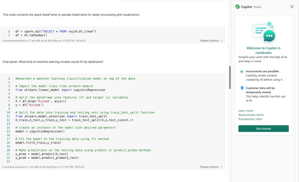

The chat pane experience makes seeking help and insights into data easy on top of notebooks. Users can use natural language to ask questions about their data, generate code snippets based on prompt inputs, and even ask Copilot to provide helpful next steps in the notebook. The Copilot chat panel shares all background context with the notebook inside of a spark session, so any executed cells or dataframes added to the notebook are available to the chat panel.
- Chat magics:

Chat magics are magic commands, such as %%chat and %%code, which can be used inside of a notebook to make requests to Copilot to provide insightful recommendations. Magics can provide assistance directly from within the notebook cell output and can be persisted as output into the notebook.
Custom Python Operations in Data Wrangler
Data Wrangler, a notebook-based tool for exploratory data analysis, has always allowed users to browse and apply common data-cleaning operations, generating the corresponding code in real time. Now, in addition to generating code from the UI, users can also write their own code with custom operations. Like every transformation in Data Wrangler, custom operations update the display grid, offering a live preview of each step before it is applied.
- Getting Started: You can initiate a custom operation either by selecting “Custom operation” from the lefthand Operations panel or by typing directly into the code editor below the display grid.

- Modifying the DataFrame: Your custom code will be previewed in the display grid in real time. Note that you can modify the DataFrame variable (df’) directly or set it equal to a new value (df = . . .’).

- Previewing the Transformation: Once you’ve stopped typing, the effect of your custom operation will be previewed in the display grid, as with any other Data Wrangler transformation. You can apply or discard the step or edit the code to modify the transformation.

Data Wrangler for Spark DataFrames (preview)
We’re pleased to announce that Data Wrangler now supports Spark DataFrames in public preview. Until now, users have been able to explore and transform pandas DataFrames using common operations that can be converted to Python code in real time. The new release allows users to edit Spark DataFrames in addition to pandas DataFrames. In both cases, you can now customize the sample that Data Wrangler displays, specifying the number of rows to show and choosing from among three sampling methods (first records, last records, or a random subset). In order to maintain performance, Spark DataFrames are automatically converted to pandas samples in Data Wrangler’s preview grid, but all the generated code will be converted to PySpark when it is exported back to your notebook.
This built-in sampling ensures that Data Wrangler feels consistent no matter what kind of data you’re working with. If you’re already familiar with Data Wrangler for your pandas use cases, you’ll notice only a few changes when you open a Spark DataFrame.
- Launching Data Wrangler: Beneath the list of pandas variables in the Data Wrangler dropdown, you’ll now see a list of Spark variables and an option to choose a custom sample.

- Exploring and Transforming Data: Once the tool loads, an informational banner above the preview grid will remind you, if you’re working with Spark data, that all the code generated by Data Wrangler will be converted to PySpark when it’s added back to your notebook.

- Exporting Code: Browsing operations and applying transformations remain the same, but when you’re ready to export the committed steps as code, Data Wrangler will display a preview of the final PySpark and provide the option to save the interim pandas code for further exploration.

MLFlow Notebook Widget
We’ve introduced the MLflow inline authoring widget, enabling users to effortlessly track their experiment runs along with metrics and parameters, all directly from within their notebook. Additionally, users can access a Run Comparison view, where they can visually compare runs using various plot types and customizations. Last, for those seeking even more insights, you can dive into the Experiment item directly from your notebook.

New Model & Experiment Item Usability Improvements
We have made significant enhancements to our model and experiment tracking features based on valuable user feedback. The new tree-control in the run details view makes tracking easier by showing which run is selected.

Furthermore, we’ve enhanced the comparison feature, allowing you to easily adjust the comparison pane for a more user-friendly experience. Run names are now highlighted across plots, making them easier to spot.

In addition, transitioning to the Run Details view is now effortless – simply click on the run name. Plus, users can now apply filters to any column, offering increased flexibility and user-friendliness, even beyond their customized columns view.

Recent Experiment Runs
We’ve made it simpler for users to check out recent runs for an experiment directly from the workspace list view. This update makes it easier to keep track of recent activity, quickly jump to the related Spark application, and apply filters based on the run status.

Models renamed to ML Models
We’re excited to share some important updates regarding a terminology shift in Fabric. We’re evolving our terminology from “Models” to “ML Models” to ensure clarity and avoid any confusion with other Fabric elements. This change will be visible in key UI elements and updated documentation, though APIs remain unaffected. While we understand that this may introduce some initial adjustments, it’s a necessary step towards enhancing the overall usability and comprehensibility of the product. This transition aligns with the upcoming general availability of Fabric and mirrors the rename of Power BI Datasets to Semantic Models, making Fabric even more user-friendly.

To learn more, you can visit: Machine learning experiments in Microsoft Fabric.
Release of SynapseML v1.0
We are pleased to announce the release of SynapseML v1.0, our open-source library that simplifies the creation of massively scalable machine learning (ML) pipelines. SynapseML makes it easy to build production ready machine learning systems on Fabric and has been in use at Microsoft for over 6 years.
This milestone release introduces new integrations with Vector Search engines for efficient management of GPT embeddings, advanced conversational AI and LLM capabilities, Orthogonal Forest DoubleML for robust causal inference, key-free authentication for Azure AI services on Fabric, and much more. This release underscores our commitment to providing powerful open-source tools for your machine learning needs and supporting the SynapseML community.
Train Interpretable Explainable Boosting Machines with SynapseML
We’ve introduced a scalable implementation of Explainable Boosting Machines (EBM) powered by Apache Spark in SynapseML. EBMs are a powerful machine learning technique that combines the accuracy of gradient boosting with a strong focus on model interpretability. With this addition, you can now leverage the EBM model in your machine learning endeavors within SynapseML, making it easier to gain insights and transparency in domains where understanding model decisions is crucial, such as healthcare, finance, and regulatory compliance.
You can learn how to train EBMs for classification or regression scenarios.
Prebuilt AI models
We are excited to announce the public preview for prebuilt AI models in Fabric. Fabric seamlessly integrates with Azure AI services, allowing you to enrich your data with prebuilt AI models without any prerequisites. Azure OpenAI Service, Text Analytics, and Azure AI Translator are available out of the box in Fabric, with support for both RESTful API and SynapseML. You can also use the OpenAI Python Library to access Azure OpenAI service in Fabric. For more information on available models, see prebuilt AI models in Fabric.
Reusing Existing Spark Session in sparklyr
We have added support for a new connection method called “synapse” in sparklyr, which enables users to connect to an existing Spark session. Additionally, we have contributed this connection method to the OSS sparklyr project. Users can now use both sparklyr and SparkR in the same session and easily share data between them.

Rest API Support for ML Experiments and ML Models
We’re pleased to begin rolling out a set of public-facing REST APIs for the main data science artifacts: the ML Experiment and the ML Model. These APIs begin to empower users to create and manage machine-learning artifacts programmatically, a key requirement for pipeline automation and workload integration. Stay tuned in the coming months for updates about more robust API support. For now, the following APIs are supported:
- List ML Experiments in a Workspace
- List ML Models in a Workspace
- Create ML Experiment
- Create ML Model
- Get ML Experiment
- Get ML Model
- Update ML Experiment
- Delete ML Experiment
- Delete ML Model
New Data Science Happy Path tutorial
We’re thrilled to announce an update to the Data Science Happy Path tutorial for Microsoft Fabric. This new comprehensive tutorial demonstrates the entire data science workflow, using a bank customer churn problem as the context. It’s the perfect resource to kickstart your data science journey on Fabric. The updated tutorial includes the following key steps:
- Ingest data into a Fabric lakehouse using Apache Spark.
- Load existing data from delta tables in the lakehouse.
- Clean and transform data with tools like Apache Spark and Fabric Data Wrangler.
- Create experiments and runs to train various machine learning models.
- Register and track trained models using MLflow and the Fabric UI.
- Perform scalable scoring with the PREDICT function and save results to the lakehouse.
- Visualize predictions and business insights in Power BI using Direct Lake.
Expansion of Data Science Samples
We are excited to announce that we have expanded our collection of data science samples by introducing new categories of samples that include end-to-end workflow samples in R and Quick tutorials samples. The two new end-to-end R samples demonstrate the entire data science workflow for the bank customer churn problem and the credit card fraud detection problem using the R language. The two new “Quick tutorial” samples also include “Explaining Model Outputs” and “Visualizing Model Behavior.” The first tutorial will walk you through the process of using SHapley Additive exPlanations to gain deeper insights into model outputs. The second tutorial shows how to leverage Partial Dependence and Individual Conditional Expectation plots to interpret the impact of various features on the model outputs.
Please check out these new samples and let us know your thoughts, as we are committed to continually improving your data science experience on Microsoft Fabric.


New Data Science Forecasting Sample
We are happy to introduce our newest Data Science sample – Sales Forecasting – developed in collaboration with Sonata Software. This new sample encompasses the entire data science workflow, spanning from data cleaning to Power BI visualization. It is designed to forecast product sales in a superstore, harnessing the power of the SARIMAX algorithm. Within this sample, you will discover comprehensive guidance on model training and parameter optimization, helping you gain a deep understanding of how to make accurate forecast predictions.
The sample also includes a Power BI report that enables you to transform your data-driven forecasts into compelling visualizations that are both informative and visually appealing.

Real-time Analytics
Delta Parquet support in KQL DB
To achieve seamless data access across all compute engines in Microsoft Fabric, Delta Lake is chosen as the unified data lake table format.
As part of the one logical copy promise, we are excited to announce that data in KQL Database can now be made available in OneLake in delta parquet format.
The data streamed to KQL Database is stored in an optimized columnar storage format with full text indexing and supports complex analytical queries at low latency on structured, semi-structured, and free text data.
Enabling KQL DB data availability in OneLake means that customers enjoy best of both worlds: they can query the data with high performance and low latency in KQL DB and query the same data in delta parquet available in OneLake via any other Fabric engines (Direct Lake mode in Power BI, Data warehouse, Lakehouse, Notebooks etc.). KQL DB provides a robust mechanism to batch the incoming streams of trickling data into Delta parquet files suitable for analysis. The Delta representation is provided to keep the data open and reusable, however, it is managed once, it is paid for once and users should consider it a single data set.
Users will only be charged once for the data storage after enabling the KQL DB data availability in OneLake.
Enabling the feature is quite simple. All that is needed is for the user to enable the Data Availability option of the selected KQL Database:

Once the feature is enabled, you should be able to see all the new data added to your database at the given OneLake path in Delta parquet.
You can now access this Delta table by creating a OneLake shortcut from Lakehouse, Data warehouse or directly via Power BI Direct Lake mode.
You can enable the OneLake availability at a table or database level.
Open Source Connectors for KQL DB
Microsoft Fabric has formally announced the release of several open-source connectors for real-time analytics. These connectors enable users to ingest data from various sources and process it using KQL DB.
New and Improved Get Data Experience for Real Time Analytics
We have released a new Get Data Experience to simplify data ingestion process In KQL DB! Designed with simplicity and efficiency in mind, this update streamlines the way you bring data into KQL DB. Whether you’re a seasoned data professional or just starting your data exploration journey, this new user experience is crafted to empower you every step of the way.
Simplifying Your Data Flow
The primary objective of the new Get Data Experience is to streamline your workflow. We understand the importance of efficiency in data exploration, and that’s why we’ve reimagined the process to minimize the number of clicks required, ensuring that you can bring data from all your familiar data sources including Event streams, One Lake, local file, Azure storage, Event Hubs, and Amazon S3.
Guided Wizard
The Get Data experience is powered by a new Guided Wizard. This step-by-step assistant takes you through the entire data ingestion process, ensuring that you’re never left in the dark. Whether you’re extracting data from various sources, transforming it to suit your needs, or loading it into KQL DB, the Guided Wizard is your knowledgeable co-pilot, offering insights and guidance at every turn.
The supported data resources that are supported by dedicated guided wizards are:
- Event Streams: Route Event Streams real-time events to KQL database destinations with no-code experience
- Onelake: OneLake comes automatically with every Microsoft Fabric tenant and is designed to be the single place for all your analytics data. You can seamlessly ingest data from OneLake into your KQL Database with just a few clicks.
- Local File: This is the simplest way to insert data into a KQL Database. You can upload a file from your local machine using the Get Data UX. This option is useful when you have a small amount of data that you want to analyze quickly.
- Azure Storage: If your data is stored in Azure Blob Storage or Azure Data Lake Storage Gen2, you can use built-in support for Azure storage to ingest it.
- Event Hubs: If you are using Azure Event Hubs to stream your data, you can seamlessly create a connection to your Azure resource from the wizard.
- Amazon S3: If your data is stored in Amazon S3, you can use built-in S3 support to ingest it. All you need is the URI of S3 bucket or individual blobs.
REST API Support for KQL Database
We’re excited to announce the launch of RESTful Public APIs for KQL DB. The Public REST APIs of KQL DB will enable users to manage and automate their flows programmatically. Here is the list of support REST APIs for the KQL DB:
- List KQL DBs
- Get KQL DB details
- Update KQL DB definition
- Delete KQL DB
You can learn the detailed usage following the Fabric REST APIs public documentation.
Splunk Add-on (preview)
Microsoft Fabric Add-On for Splunk allows users to ingest logs from Splunk platform into a Fabric KQL DB using the Kusto python SDK.
When we add data to Splunk, the Splunk indexer processes it and stores it in a designated index. Searching in Splunk involves using the indexed data for the purpose of creating metrics, dashboards and alerts. This Splunk add-on triggers an action based on the alert in Splunk. We then use Alert actions to send data to Microsoft Fabric KQL DB using the specified addon.
The add-on uses Kusto python SDK (https://learn.microsoft.com/azure/data-explorer/kusto/api/python/kusto-python-client-library) to send log data to Microsoft Fabric KQL DB. The addon supports queued mode of ingestion by default. The addon boasts of a durable feature which helps to minimize data loss during any unexpected network error scenarios. But durability in ingestion may impact throughput, so it is advised to use this option wisely.
The following describes the stages needed:
- Download and install the Microsoft Fabric Addon
- Create an Splunk Index
- Create a KQL DB and table
- Create a Splunk Alert that defines the data to be ingested into KQL DB and select the Trigger Actions = “Send to Microsoft”.
- Configure the connection details to point to the KQL DB
Event Streams is now Generally Available
We’re pleased to announce Event Streams GA with a slew of enhancements aimed at taking your data processing experience to the next level. These updates, focused on enhancing efficiency and user experience, include data transformation to the KQL Database, seamless data ingestion from Eventstream in other Fabric items, and optimization of Lakehouse tables. These changes are made to transform the way you manage your data streams.
Event Streams Data Transformation for KQL DB (Generally Available)
Now, you can transform your data streams in real time within Eventstream before they are sent to your KQL Database. When you create a KQL Database destination in the Eventstream, you can set the ingestion mode to “Event processing before ingestion” and add event processing logic such as filtering and aggregation to transform your data streams. With this feature, you have greater control and flexibility over your data streams, ensuring that it’s perfectly structured for your database.

Get Data from Eventstream Anywhere in Fabric
If you’re working on other Fabric items and are looking to ingest data from Eventstream, our new “Get data from Eventstream” feature is here to help you. This feature enables you to seamlessly ingest Eventstream data to various Fabric items, offering both flexibility and convenience. It simplifies the process of routing your data streams efficiently throughout the entire Fabric environment.
The following screenshots show how to “Get data” from Eventstream while you are working with a KQL database and Lakehouse: 
Create a Cloud Connection within Eventstream
We’ve simplified the process of establishing a cloud connection to your Azure services within Eventstream. When adding an Azure resource, such as Azure IoT Hub and Azure Event Hubs, to Eventstream, you can now create the cloud connection and enter your Azure resource credentials right within Eventstream. This enhancement significantly improves the process of adding new data sources to Eventstream, saving you time and effort.
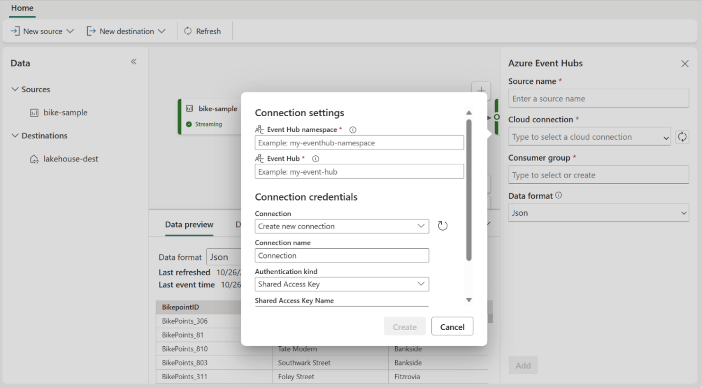
Two Ingestion Modes for Lakehouse Destination
To cater to your specific requirements, we’ve introduced two distinct ingestion modes for your Lakehouse destination. You can select one of these modes to optimize how Eventstream writes to Lakehouse based on your scenario.
- Rows per file – You can now specify the minimum number of rows that Lakehouse ingests in a single file. The smaller the minimum number of rows, the more files Lakehouse will create during ingestion.
- Duration – You can now specify the maximum duration that Lakehouse would take to ingest a single file. The longer the duration, the more rows will be ingested in a file.
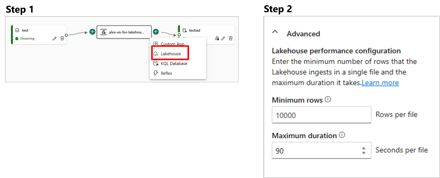
Optimize Tables before Ingesting Data to Lakehouse
Our customers have inquired about compacting numerous small streaming files generated on a Lakehouse table. We have a solution for you! Table optimization shortcut is now available inside Eventstream Lakehouse destination – This helps the user by opening a Notebook with Spark job which would compact small streaming files in the destination Lakehouse table.
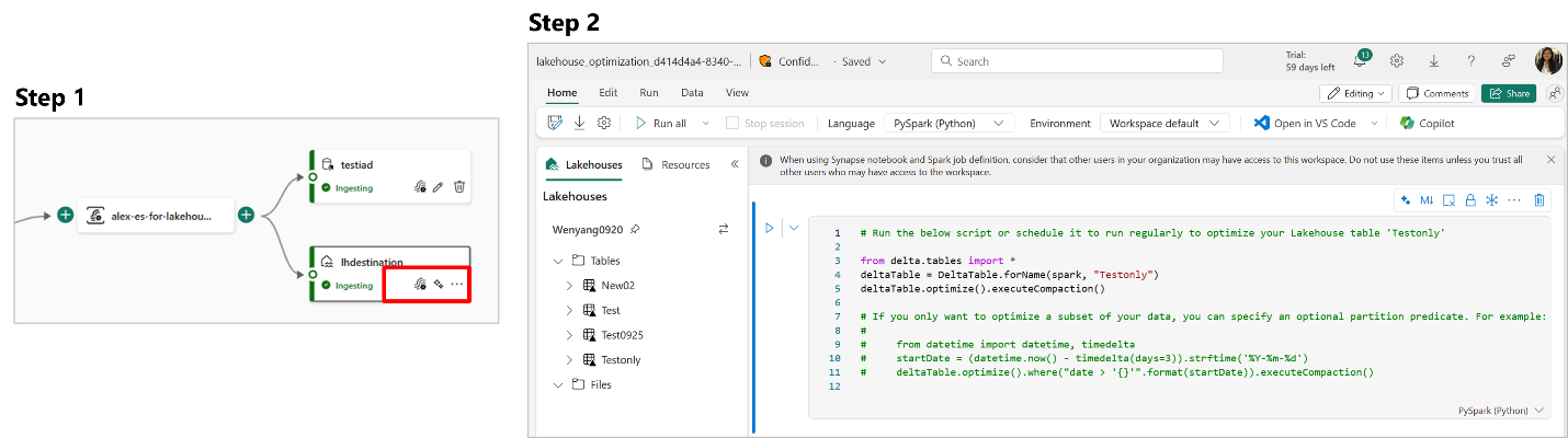
Data Factory
Dataflow Gen2
General availability of Fabric connectors
The connectors for Lakehouse, Warehouse and KQL Database are officially out of public preview and generally available. We encourage you to use these connectors when trying to connect to data from any of these Fabric experiences.
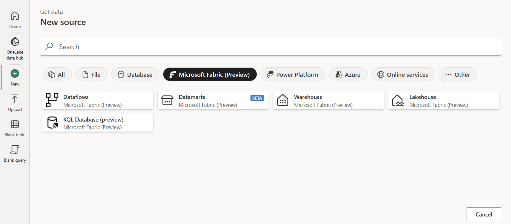
Automatic refresh cancellation
When you set Dataflow for a refresh, the dataflow refresh process has a timeout of 8 hours. This means that your Dataflow cannot run for more than 8 hours for a single refresh job. However, during those 8 hours you could be consuming resources and the operation might be in a loop due to an unforeseen situation with your data source or one of the logics in your Dataflow.
To prevent unnecessary resources from being consumed, we’ve implemented a new mechanism that will stop the refresh of a Dataflow as soon as the results of the refresh are known to have no impact. This is to reduce consumption more proactively.
Error message propagation through gateway
We made diagnostics improvement to provide meaningful error messages when Dataflow refresh fails for those Dataflows running through the Enterprise Data Gateway.
Support for column binding for SAP HANA connector
Column binding is described as follows:
Data fetched from the data source is returned to the application in variables that the application has allocated for this purpose. Before this can be done, the application must associate, or bind, these variables to the columns of the result set; conceptually, this process is the same as binding application variables to statement parameters. When the application binds a variable to a result set column, it describes that variable – address, data type, and so on – to the driver. The driver stores this information in the structure it maintains for that statement and uses the information to return the value from the column when the row is fetched.
Enabling support for column binding for SAP HANA as an optional parameter will result in significantly improved performance for users that opt into the feature.
Staging artifacts will be hidden.
When using a Dataflow Gen2 in Fabric, the system will automatically create a set of staging artifacts which support the Dataflow Gen2 operation by providing storage and compute engine for processes that require it such as staging of queries or the Data destination feature. You can find more details regarding this in this earlier blog post: Data Factory Spotlight: Dataflow Gen2 | Microsoft Fabric Blog
Starting today, these artifacts will be abstracted from the Dataflow Gen2 experience and will be hidden from the workspace list. No action is required by the user and this change has no impact on any Dataflows that you’ve created before.
New Power Query Editor style
The Power Query Editor user interface used inside of Dataflows Gen2 has been updated to match the style used throughout Microsoft Fabric.
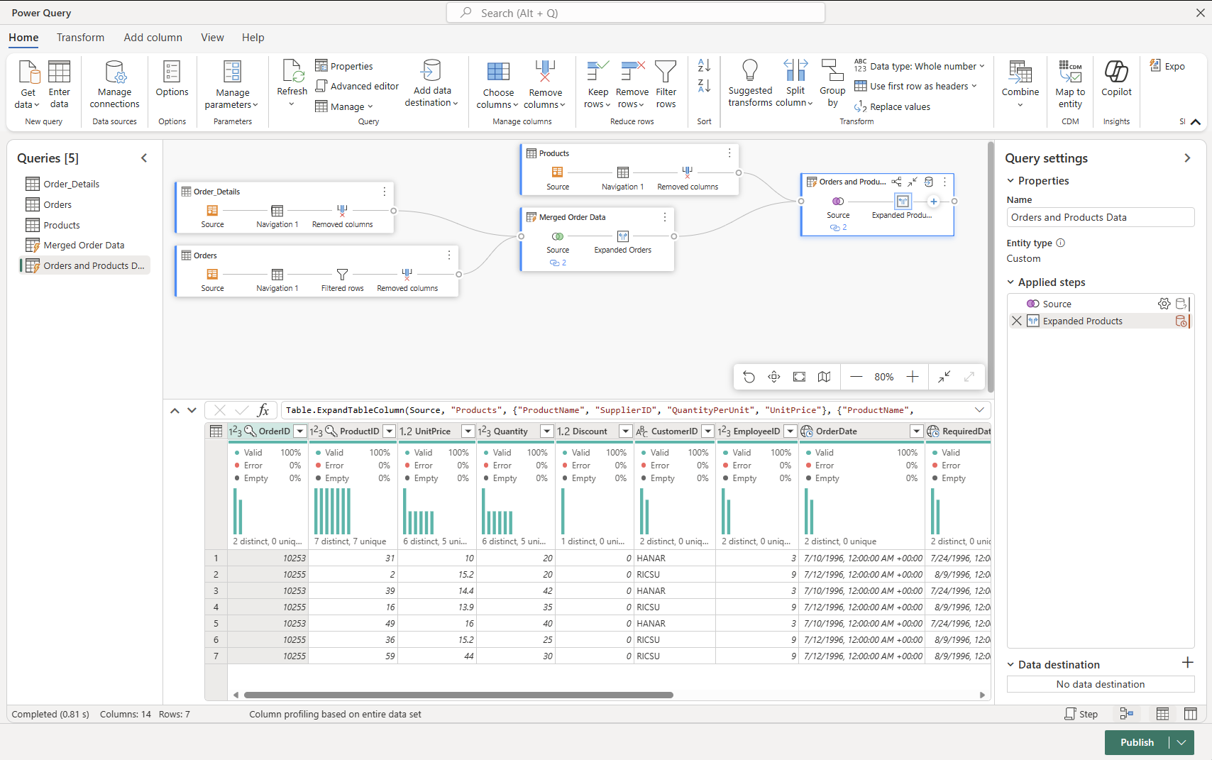
Support for VNET Gateways (preview)
We’re also very excited to announce that we’re releasing VNet Data Gateway support for Dataflows Gen2 in Fabric as a Public Preview feature today. The VNet data gateway helps customers to connect from Fabric Dataflows Gen2 to their Azure data services within a VNet without the need of an on-premises data gateway. The VNet data gateway securely communicates with the data source, executes queries, and transmits results back to Fabric.
You can learn more about VNET Gateways from the following link.
Pipelines
Cross workspace “Save as”
You can now clone your data pipelines across workspaces by using the “Save as” button. This makes it easier to develop pipelines collaboratively inside Fabric workspaces without having to redesign your pipelines from scratch.
Dynamic content flyout integration with Email and Teams activity
In the Email and Teams activities, you can now add dynamic content with ease. With this new pipeline expression integration, you will now see a flyout menu to help you select and build your message content quickly without needing to learn the pipeline expression language.
Copy activity now supports fault tolerance for Fabric Data Warehouse connector.
The Copy activity in data pipelines now supports fault tolerance for Fabric Data Warehouse. Fault tolerance allows you to handle certain errors without interrupting data movement. By enabling fault tolerance, you can continue to copy data while skipping incompatible data like duplicated rows.
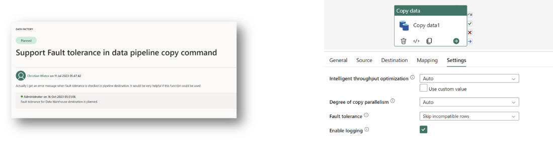
MongoDB and MongoDB Atlas connectors are now available.
We’re excited to announce that the MongoDB and MongoDB Atlas connectors are now available to use in your Data Factory data pipelines as sources and destinations. In your data pipeline, you can create a new connection to your MongoDB or MongoDB Atlas data source to copy, extract, and transform your data.
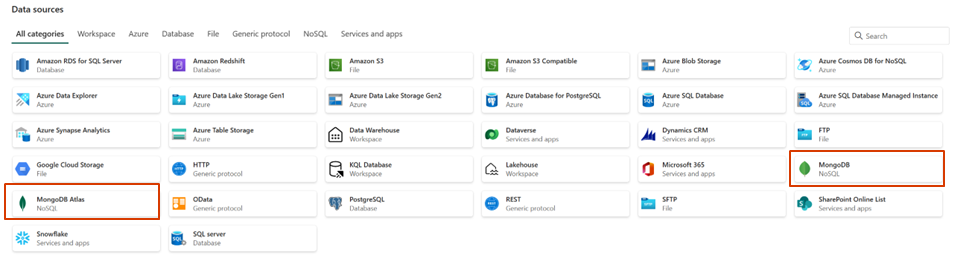
Microsoft 365 connector now supports ingesting data into Lakehouse (preview)
We’re excited to share that the Microsoft 365 connector now supports ingesting data into Lakehouse tables.
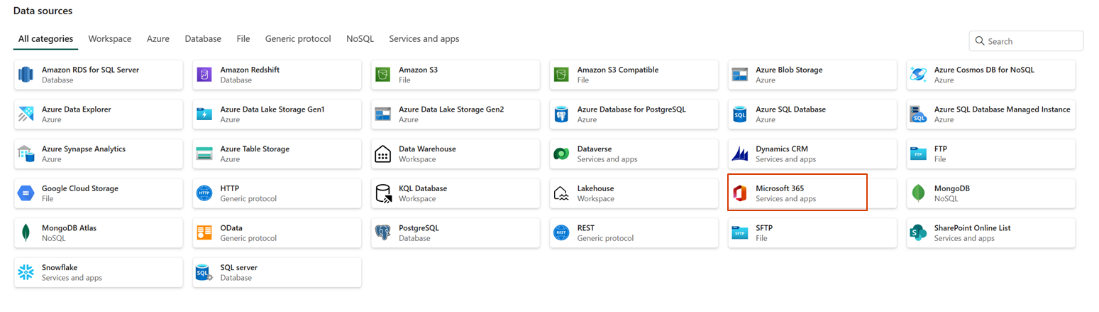
Multi-task support for editing pipelines in the designer from different workspaces
You can now open and edit data pipelines from different workspaces and navigate between them using the multi-tasking capabilities in Fabric.
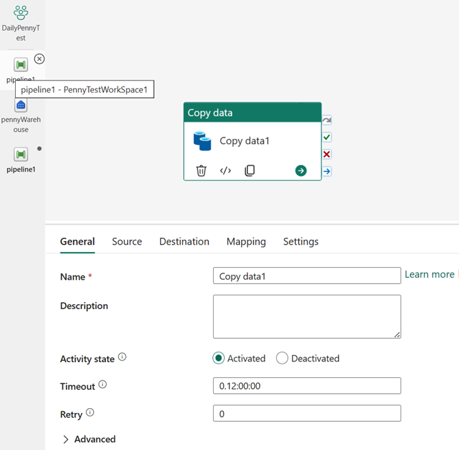
String interpolation added to pipeline return value
You can now edit your data connections within your data pipelines. Previously, a new tab would open when connections needed editing. Now, you can remain within your pipeline and seamlessly update your connections.
Community and Learning
Skill up on Fabric with the Microsoft Learn Cloud Skills Challenge
We are excited to announce the Microsoft Ignite: Microsoft Fabric Challenge as part of the Microsoft Learn Cloud Skills Challenge. Skill up for in-demand tech scenarios, and enter to win a VIP pass to the next Microsoft Ignite. The challenge is on until January 15, 2024.
In this challenge, you will learn how to connect to data, ingest it with Data Factory and notebooks, store it in the lakehouse or data warehouse, and create Power BI reports to turn your data into competitive advantage.
The challenge will help you prepare for the Microsoft Certified: Fabric Analytics Engineer Associate certification and new Microsoft Applied Skills credentials covering the lakehouse and data warehouse scenarios, which are coming in the next months.